
🌡️ Product Analytics
Data-driven e-commerce merchandising and more.
What is Product Analytics?
Product Analytics is a Northbeam dashboard that shows you how well your ads are working in relation to the products they sell. This is data-driven merchandising for e-commerce businesses.
By measuring your ads, products, campaigns, and platforms against each other on relative “indexes” of CAC and ROAS, you can easily identify your best and worst performing ads, and which products those ads are driving sales towards.
This is useful for businesses that have high numbers of SKUs, do complex bundling schemes, or have bigger strategies for driving repurchases or upsells to existing customers via ad campaigns.
The cornerstone of the Product Analytics Dashboard is the scatterplot, which visualizes your assets and products against each other on a relative scale and groups them into four quadrants. The dashboard also has a table function that allows you to refocus the scatterplot into specific products, platforms, campaigns, or individual ads.
This approach to visualizing product performance can feel unfamiliar at first. However, this guide will empower you to become a Product Analytics guru, giving you a new tool in your arsenal for driving marketing profitability.
Product Analytics Walkthrough Video
Where is Product Analytics?
Product Analytics is available in the left-hand sidebar of Northbeam, under the “Attribution” tab, select Product Attribution.

How do you read the Product Analytics dashboard?
Understanding the scatterplot
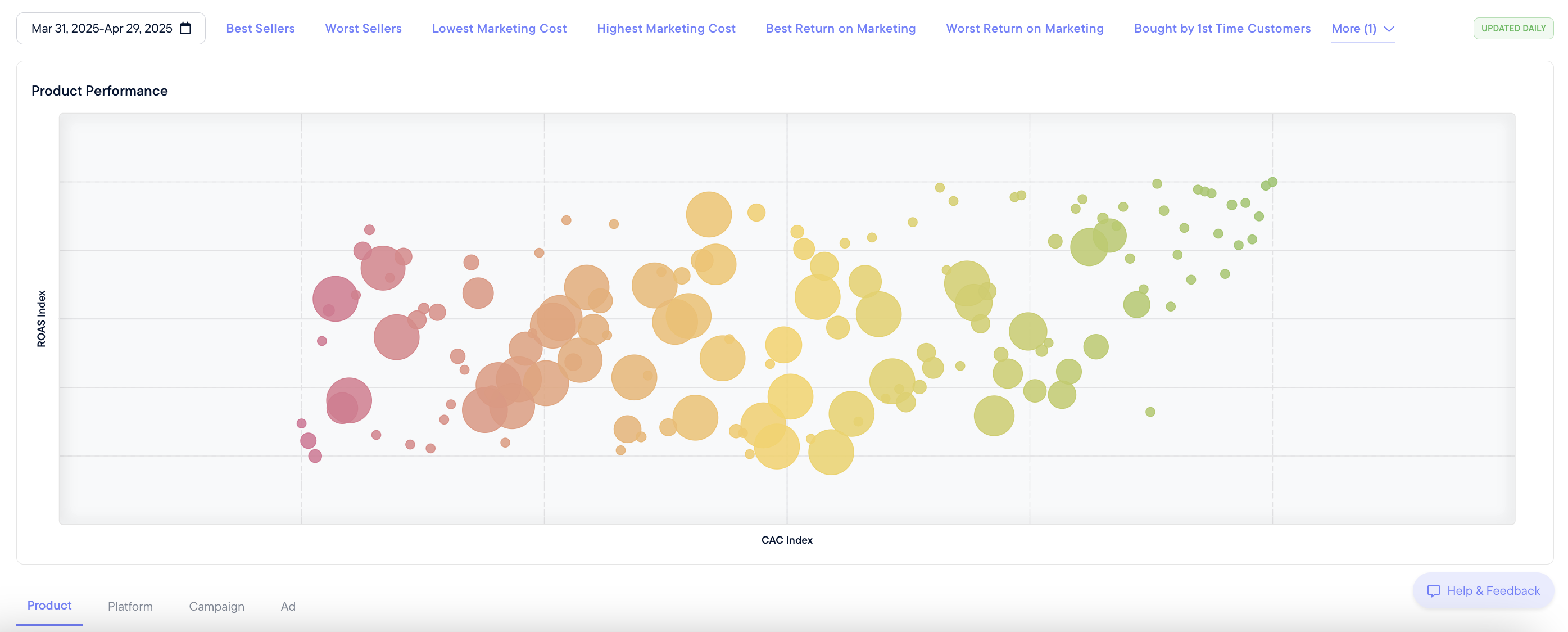
The most important thing to understand about Product Analytics is the scatterplot. It is divided into four colors, which we call “quadrants” (defined later in this guide). Each bubble represents one of your products or assets.
Throughout this documentation, we say “products" or "assets” when speaking about the scatterplot.This is because this chart shows either products, platforms, campaigns, or ads, depending on the filter you’ve chosen in the screenshot below.

Try the Product filter, then hover over a bubble and read the tooltip. The size of the bubble represents the relative ad dollars spent on each product, platform, campaign, or ad, depending on the filter selected.
The scatterplot shows how all your marketing assets or products fall on a relative scale against each other. They are not against a benchmark - this is only your assets against each other in a vacuum. To do this, we create both a ROAS Index and a CAC Index of your assets and products.
Understanding the ROAS Index and CAC Index

The “ROAS Index” is a measure from 1 to 100. This takes the ROAS of all your products or marketing assets and scores them against each other on a scale of 1 to 100 - the highest ROAS ad placement would get a score of 100, and your lowest ROAS ad would get a score of 1.
The “CAC Index” is also a measure from 1 to 100, instead of scoring all your assets or products together on a CAC level. Your worst-performing CAC asset would get a score of 1, and your best-performing asset by CAC would get a CAC Index score of 100.
By using these indexes, we can effectively put all your assets together on one chart and visualize how well each asset of your marketing strategy is working in relation to all the others.
Understanding the colors and quadrants
Questions to ask yourself while analyzing the dashboard.
Each color of the scatterplot represents a specific analysis of the marketing assets that fall within that quadrant.
The quadrants are as follows:
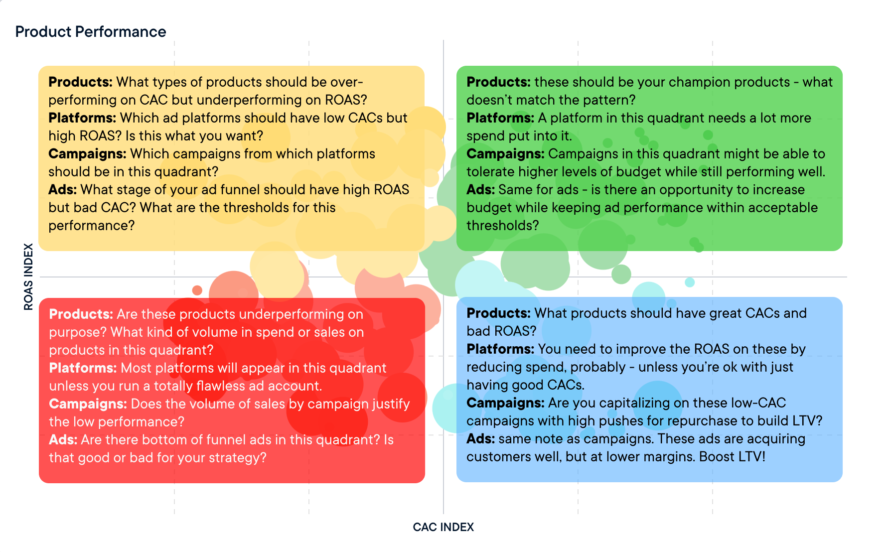
- Yellow - Top Left Quadrant - High ROAS, High CAC: these represent the assets or products that are in the top 50% of your assets by ROAS performance, but are in the bottom 50% of your assets or products based on CAC performance.
- Green - Top Right Quadrant - High ROAS, Low CAC: these represent the assets or products that are in the top 50% of all assets or products for both CAC and ROAS. These are your best performers.
- Red - Bottom Left Quadrant - Low ROAS, High CAC: these are your “underperformers.” These are in your bottom 50% of ROAS performance and bottom 50% of CAC performance.
- Blue - Bottom Right Quadrant - Low ROAS, Low CAC: These are performing in the top 50% by CAC but in the bottom 50% on a ROAS measure.
Not all red quadrant assets are bad, and not all green quadrant assets are good. What’s important is understanding why assets are in specific quadrants and what that means for your business.
Understanding the filters and quick analysis buttons
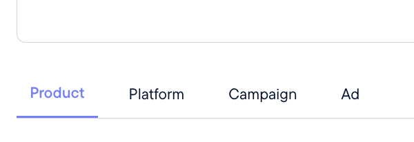
The four filters above will change the data that appears on the chart and in the table.
- Product: shows all your product SKUs and the marketing metrics associated with each one.
- Platform: shows all your advertising channels (Meta, Applovin, TikTok, etc.)
- Campaign: shows all your ad campaigns across platforms.
- Ad: shows all individual ads across platforms.
Pro tip: You can also click into the empty space in any quadrant to automatically filter for all the assets or products in that quadrant.
These filters can “stack” as well. Click the check box in the far left of each row that you want to keep in the chart, and it will create a filter you can see at the top of the table.
NOTE: Should we put in a visual for the above?
For example, you could filter specific products and campaigns to only show ads from Google that sell a handful of specific SKUs.
Quick analyses buttons
These buttons will show you some quick analyses based on the four quadrants seen in the charts. Use these to get you started. They will automatically filter your scatterplot and table, and you can unclick to remove them.
Please note that you may need to snap between the four filters to refresh the chart once you've unclicked a quick analysis button.

When should you use Product Analytics?
There are two major use cases for using the Product Analytics dashboard. These are best understood by framing them as questions:
Are your ads actually selling the products they are trying to sell?
For example: imagine you are a beauty business. You run many ads for your lip gloss, which is your best performing “hero” product. However, when you check this ad in Product Analytics you notice that only 60% of orders that came from this ad contain the product the ad is promoting, and 40% of orders are for products that are not mentioned at all.
This could uncover some opportunities:
- Are there popular products that you are not running ads for? These could prove to be successful ad campaigns on their own.
- Are your hero product ads actually performing better or worse than the rest of the ads in your portfolio? There could be opportunities to increase or reduce spend and be more efficient.
- Should the landing page be structured differently to increase revenue per visitor (RPV)? If you’re noticing a trend in products purchased that were not promoted in the ad, offering that product in an upsell or bundle may increase RPV and unlock more room to scale the ad.
- Are there opportunities to improve your CAC or ROAS on specific ads that you haven’t been paying attention to? Overperformers in the yellow and blue quadrants could turn into big moneymakers.
To answer these questions, we can look at the scatterplot on the ad level filter and look at our favorite, most recognizable ads. Where do they land on the chart?
Do you have a product that is selling well, but you are not sure which ad campaign is actually driving those sales?
Imagine the beauty business again. Your second top-performing product could be a beauty blender that doesn’t appear in any of your “top” campaigns.
Which ads are people clicking on that are driving these beauty blender sales? There may be opportunities to scale spend. What other products are people buying alongside this overperformer? Bundling could be an option.
To see these analyses, we would pick a specific SKU from the Products tab and check the box on the left of that row. That would allow that product to carry over across the Platform, Campaign, and Ad filters, showing you which marketing assets are most responsible for those sales in both the scatterplot and the table.
You should look at Product Analytics on a monthly basis to identify any changing trends around seasonality, promo periods, or if you need some ideas for new creative strategies to try.
Taking action on Product Analytics data
The Product Analytics dashboard can reveal complex relationships between your products and your ads. Each business is different, which makes it challenging to say exactly what you “should do” based on the data you see in these charts.
However, here are some overarching recommendations:
-
Analyze this data while keeping in mind the specific context of your business.
- For example, we recommend you have the COGS (costs of goods sold) for each product readily available to view alongside this data. That can add another layer to this analysis, which makes point #2 easier to understand:
-
No quadrants is inherently good or bad - it depends entirely on context.
- Your top-performing ad for new customer acquisition is likely to be in the bottom left red quadrant, for example. This is not a bad thing, per se. That ad is likely shown to a wide net of potential new customers, many of whom will not purchase, resulting in low ROAS and high CAC. You must understand what your ads are "doing" at each stage of the funnel and how that might affect their ROAS or CAC. If you understand this, then you can look at the quadrants and know if an ad “should” be in that quadrant or not.
-
To understand why an asset or product is in a specific quadrant, and what to do about it, consult our Quickstart Guide (coming soon).
Access to Product Analytics
Product Analytics is free for all Northbeam users who are on Shopify. We are slow-rolling this feature out to all clients in 2025. If you would like earlier access, let us know by emailing your account manager at Northbeam.
✅ Next stop
This Product Analytics feature allows you to dive into how your products are performing, what's driving conversions, and how each insight can inform your marketing strategy across all channels. Let's keep going and learn about Creative Analytics.
Updated 10 months ago