
🔭 Metrics Explorer Home Page
Understand the power of Northbeam's correlation visualization dashboard.
Want the TL;DR? Read our "Metrics Explorer Quick Start Guide." 🚀
Ready to master Metrics Explorer? Read our Best Practices Guide. 🤘
What is Metrics Explorer?
Watch this video for the full tour and explanation!
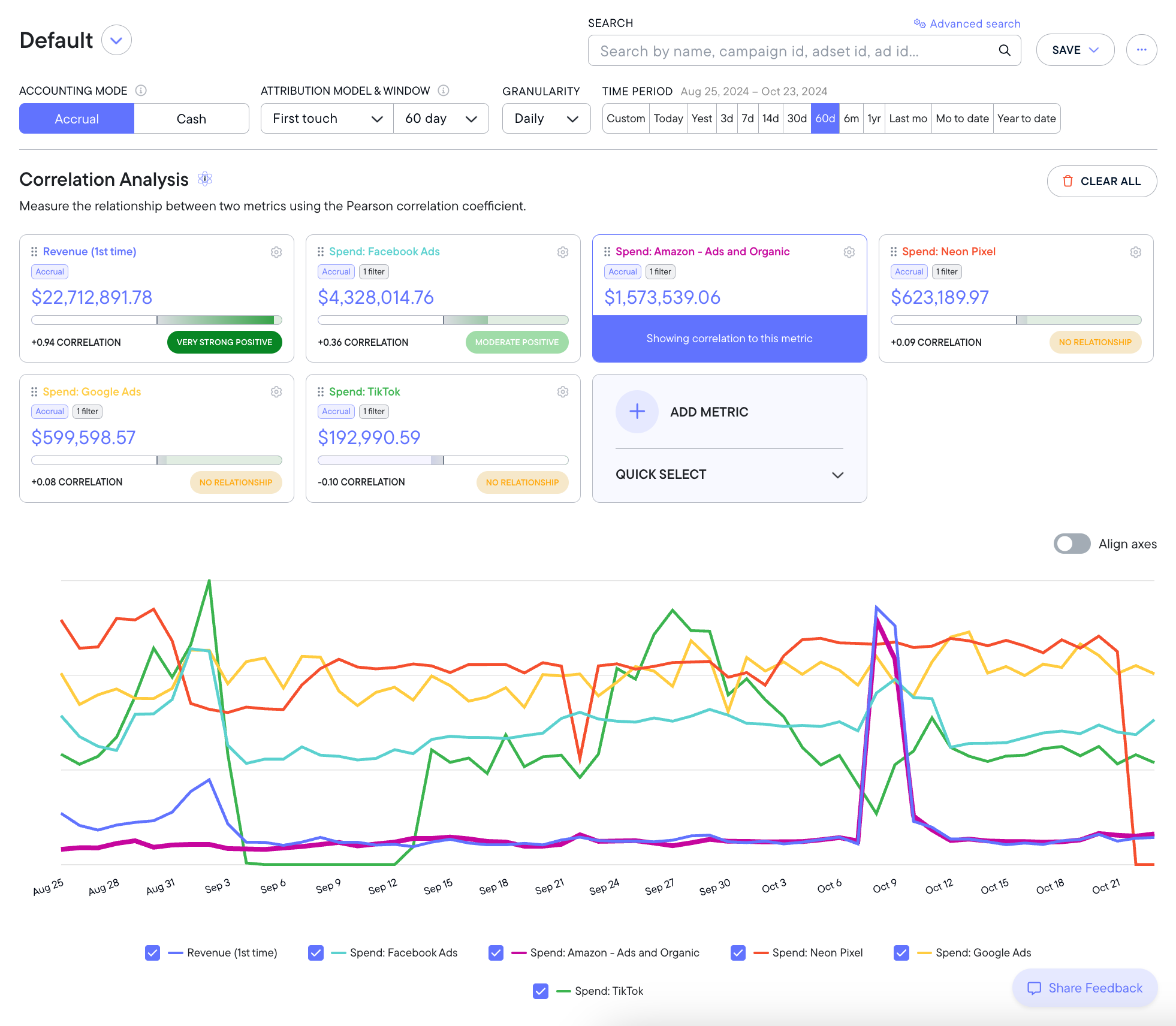
Sample Metrics Explorer dashboard, loaded up with correlations and metrics.
Metrics Explorer is a dashboard that demonstrates the direction and intensity of relationships between your marketing metrics over time. It gives you confidence in understanding how specific ad campaigns, spending flights, or performance trends are affecting other parts of your marketing strategy. Metrics Explorer is built on the Pearson Correlation Coefficient, a widely-trusted statistical model (more on this below).
Metrics Explorer can help you understand how your marketing strategies have affected specific outcomes. For example, Metrics Explorer could demonstrate that over the last 90 days, there is a moderately strong relationship between your Facebook Spend and your Google Branded Search Revenue.
You can measure these correlations over unlimited time periods, a variety of attribution models, and lookback windows, daily/weekly/monthly granularity, and even accrual or cash accounting modes. Metrics Explorer also features customizable views you can save and export, making reporting a breeze. Like all of your Northbeam dashboards, this one is powered by your unique first-party data.
Metrics Explorer is available to all Northbeam users. Enterprise-tier Northbeam users have access to multiple correlations at once - contact our sales team if you are interested in upgrading to Enterprise.
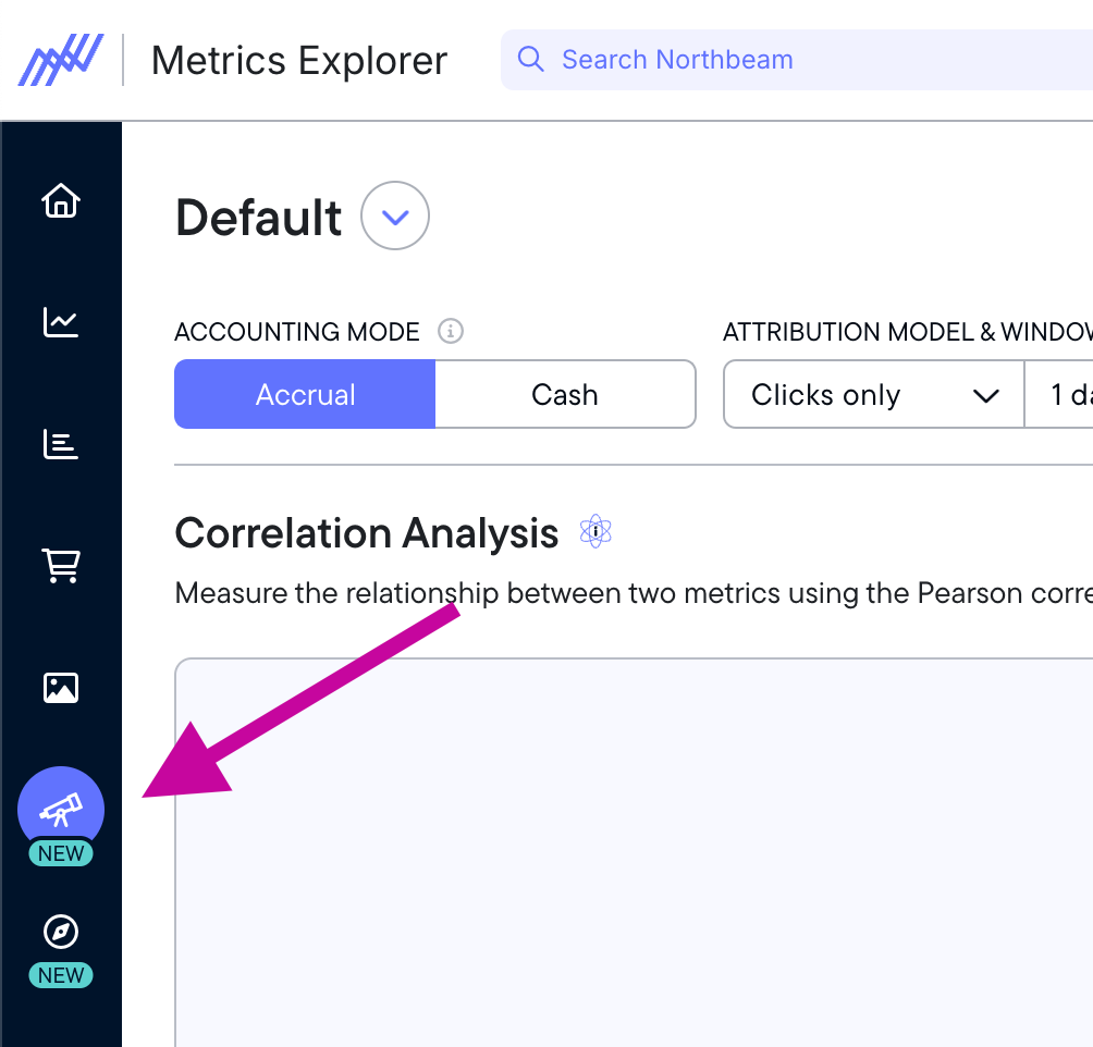
Where is Metrics Explorer?
You can access Metrics Explorer by clicking the telescope icon in the left hand navigation bar.
When should you use Metrics Explorer?
Whether you're analyzing past performance or planning future experiments, Metrics Explorer makes it easy to understand how your different marketing strategies are impacting each other. For example: it is well-known in digital marketing that advertising spend will increase Amazon revenue, even if those ads don’t run on Amazon. This is because customers will often learn about a product on a different channel (like Facebook) then decide to purchase it on Amazon for faster shipping.
With Metrics Explorer, you can measure that correlation scientifically and understand exactly how strong the relationship is between your ad spend and Amazon revenue.
Knowing the relationships between your metrics can give you confidence in whatever strategic decisions you intend to make. For example, you may have a suspicion that your Google Ads spend is not improving your revenue, and you might want to cut that spend. Before doing so, you could use Metrics Explorer to evaluate the relationship between your Google Ads spend and other important metrics like transactions, revenue, or even engagement metrics like video views or email signups. You may discover that while your Google Ad spend doesn’t affect your revenue, cutting it would have a strong negative impact on your Google email signups, or other leading indicator.
This understanding gives you insights into the potential impact of any choice you make. The most sophisticated users of Metrics Explorer seek to understand how any budget adjustments, media flights, and new channel tests affect other parts of their business – even on metrics that might not seem immediately obvious.
Remember: correlation doesn’t imply causation. Read more on this below.
How does Metrics Explorer work?
As mentioned above, Metrics Explorer uses the Pearson Correlation Coefficient (PCC), a statistical and mathematical model that measures the linear relationship between two sets of data. The Metrics Explorer dashboard makes it easy to apply the PCC to your Northbeam data by making a modular customizable dashboard to run these correlations on any data set you have in Northbeam.
Understanding Pearson Correlation Coefficient
The Pearson Correlation Coefficient is a well-known statistical analysis that marketers have used for generations. What makes Metrics Explorer special is that it allows you to easily compare Northbeam first-party data.
The PCC will measure two variables and give an output between -1 and +1.
- Values close to +1 indicate a strong positive correlation
- Values close to -1 indicate a strong negative correlation
- Values close to 0 indicate little to no correlation (neutral)
The sign shows the direction, while the magnitude shows the strength of the relationship. Understanding the “direction” of the relationship can be a little tricky - but Metrics Explorer makes it easy.
How to interpret Metrics Explorer results
Metrics Explorer uses the PCC to measure and visualize the relationship between two variables.
Metrics Explorer visualizes this by identifying your “primary metric” (highlighted in purple) and the “target metric” (which features a correlation score.)
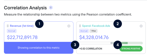
- Revenue (1st time) - This is the primary metric, highlighted in purple.
- Spend: Facebook Ads - This is the target metric.
- +0.53 - This is the correlation score.
- Strong Positive - This is the relationship tag based on the correlation score.
Metrics Explorer tags each result with a relationship label to make it easier to understand. The labels are:**
| Correlation Type | Definition |
|---|---|
| Very strong negative | As the primary metric increases, the target metric almost always decreases significantly. |
| Strong negative | When the primary metric goes up, the other tends to go down consistently. |
| Moderate negative | There’s a noticeable tendency for the target metric to decrease as the primary metric increases. |
| Weak negative | There’s a loose pattern where the target metric decreases slightly as the primary metric increases. |
| No relationship | Changes in the primary metric don’t predict changes in the target metric. |
| Weak positive | There’s a slight tendency for both metrics to increase together. |
| Moderate positive | As the primary metric rises, the target metric tends to increase, though not always. |
| Strong positive | When the primary metric goes up, the target metric usually increases too. |
| Very strong positive | Both metrics almost always rise together in sync. |
Understanding correlation vs. causation
"Correlation does not imply causation" is a fundamental principle in statistics and scientific research. It means that just because two variables are related or appear to change together, it doesn't necessarily mean that one causes the other.
Just because Metrics Explorer is demonstrating a relationship, it doesn't mean that one metric is the reason another metric changed. It also doesn't mean that a future relationship is guaranteed.
Example: Ice cream sales and drowning rates both increase in summer. They're correlated, but one doesn't cause the other. The common cause is warmer weather — and trips to the beach!
Understanding that correlation is equal to causation is crucial for critical thinking, scientific research, and avoiding logical fallacies in data interpretation.
Metrics Explorer allows you to have confidence in identifying the relationships between metrics, but there could be any number of factors that actually drive causation. This principle reminds us to be cautious when interpreting data and to look for additional evidence before concluding causal relationships.
Example interpretation
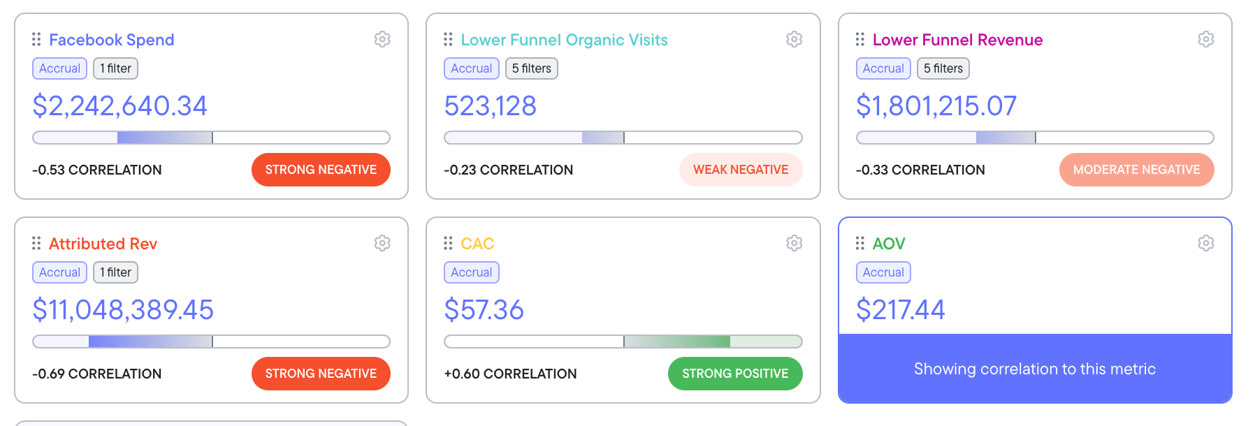
Let's put this into marketing terms. Below is a set of tiles set over 60 days of data.
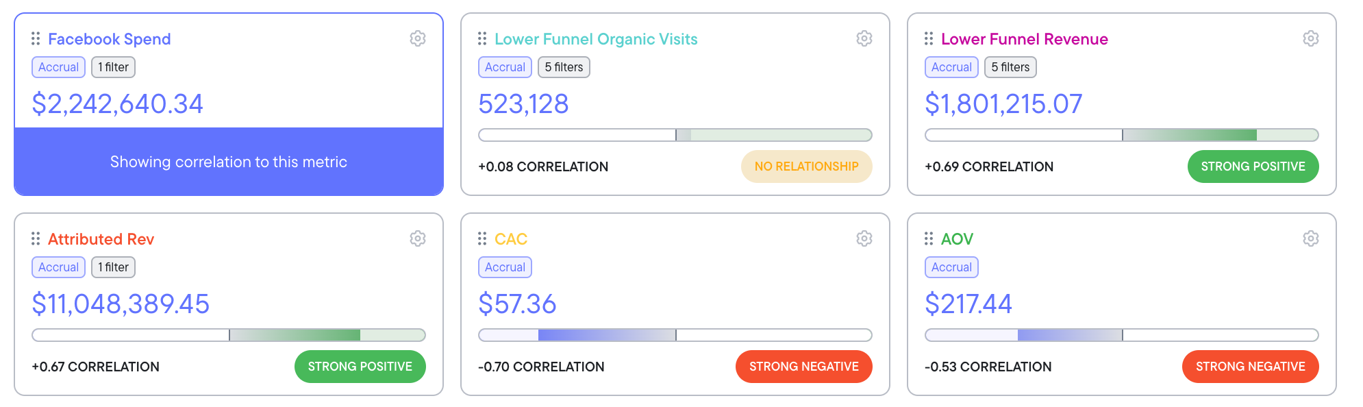
In this example, we've chosen Facebook Spend as our primary metric, identified by it's purple highlight and caption. This means all other metrics tiles visible are showing their correlations to Facebook Spend, the primary metric.
We can see that Attributed Revenue had a strong positive correlation with Facebook Spend in this time period. That means that during this time period, as Facebook Spend went up, so too did Attributed Revenue.
We can also see that Customer Acquisition Cost (CAC) has a strong negative relationship over this timeframe. In the case of CAC, this is a good thing - we want CAC do go down. Negative does not necessarily mean bad - these nuances are important to understand if you want to leverage the full power of Metrics Explorer.
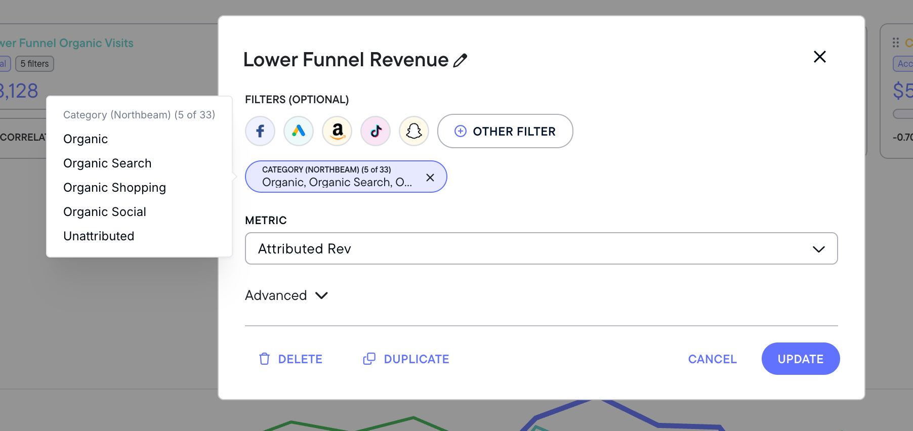
You'll note that we've added some custom metrics to this view. "Lower Funnel Organic Visits" is a custom filtered metric summarizing organic visits across platforms. See the filter below.
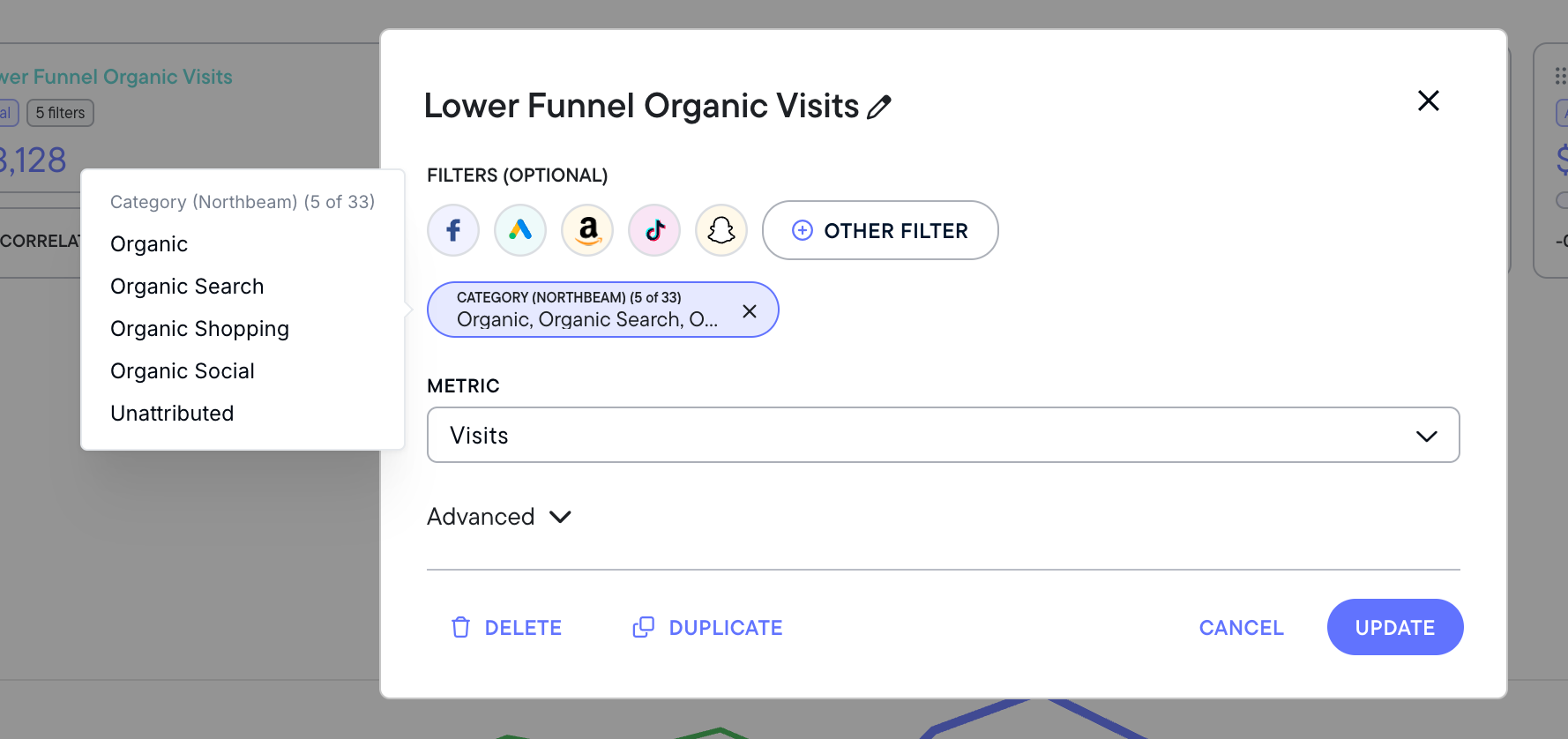
As you can see from the yellow "No relationship" tag, Lower Funnel Organic Visits had no relationship over this timeframe, meaning that increases in Facebook Spend did not drive significant changes in this metric. However, "Lower Funnel Revenue," our custom filtered metric tracking revenue on these same channels, showed a strong positive relationship.
This suggests that increased Facebook Spend drove attributed organic revenue - a big signal in understanding the halo effect of your paid ads on organic results.
You can use the same tiles but select a different primary metric in order to see how these relationships change against each other. Using the same set of metrics, we've now selected average order value (AOV) as our primary metric.
Notice how all the tiles change to demonstrate their relationship against AOV.
It's critical for marketers to validate every assumption they have with data. This creates trust in your metrics, making it easier for you to evaluate the right choices for your boss, your stakeholders, your clients, and your own team.
In this example, it's clear there's a strong positive relationship between AOV and CAC. This means as AOV goes up, so does CAC. This makes sense - perhaps ads offering higher AOV bundles of products are less likely to draw in customers, meaning acquisition costs rise.
There's also a weak negative relationship between AOV and Lower Funnel Organic Visits. This makes sense, too - AOV is more a function of product price, discounting, and bundling than visits.
For Attributed Revenue, there's a strong negative relationship with AOV. This probably means the business is running some sort of discount through this time period - how else would the AOV be going up while revenue is going down?
As you can see, Metrics Explorer can help you understand, discover, and report on hidden relationships throughout all your metrics.
Access to Metrics Explorer
Metrics Explorer is free for all Northbeam users. However, because significant data processing costs are related to more complex correlations, only Enterprise-level Northbeam users can access multiple correlations at one time (as seen in the example above.)
Want to see multiple correlations at the same time? Talk to our team about upgrading to Enterprise to unlock the full power of Northbeam.
✅ What's next?
This Metric Explorer dashboard is a powerful tool in Northbeam, and learning this information will help you understand how different marketing metrics are connected over time.
You can review the Metric Explorer Quickstart Guide or Metric Explorer's 7 Best Practices, or you can head into the next section where we'll cover key strategies and recommendations that will help you get the most out of Northbeam.